The Food Label Gets Smart
SAGE TEASES A HEALTHIER WAY TO TRACK YOUR DIET, WITH AN INTERACTIVE TAKE ON THE STANDARD NUTRITION LABEL.
The American nutrition label is deeply flawed. Its portions are erratic and difficult to mentally scale (why 20 crackers?). Its ingredients are listed but often written in indiscernible scientific code. And the label has no idea how many calories you burn in a day. Are you a 7-foot-tall weightlifter or a 5-foot-tall couch potato? It doesn’t know.
Sage is a startup aimed at fixing these problems. It’s a new food label platform by Sam Slover—the same designer who brought us Wrap Genius—who has been working with New York City nutritionists and dietitians to create an alternative to what’s printed on every box, as required by the Food and Drug Administration.
The result is a colorful dashboard exploring 2,000 products you’ll find at the grocery store. You sign up by entering your sex, height, weight, and activity level, and Sage will personalize these nutritional labels for you, not based upon the one-size-fits-all 2,000-calorie-a-day figure from the FDA, but based upon you.
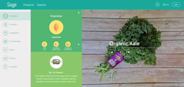
For me, a relatively inactive, 6-foot-tall male, I was given a quota of 2,500 calories a day. From here, I click through Sage’s photo database of foods to create infographic-style breakdowns of various items I could buy at the grocery store.
It’s got some great ideas. For one, the interface is bright and colorful. It’s a borderline optimistic rainbow that makes nutrition mining less depressing—which has more than superficial value.
"We did a lot of different design tests," Slover tells Co.Design. "We found it was an area where people were expecting the information to be boring. People haven't had a great interaction with nutritional data in the past, by using a colorful design, we instantly get people interested in it."
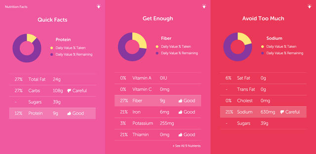
It’s also interactive. I can change my serving size on a dropdown menu, and all the numbers change. The food’s top nutrients are called out in a bar graph. The good stuff (like vitamins, minerals, and fiber) and bad stuff (like saturated fat, sodium, and sugar) are divided into clever labels—"Get Enough" and "Avoid too Much."
"One bit of feedback we got was to not be so judgmental about this data. To be more subtle with judgement about it," Slover says. "So instead of using, red this is good, green this is bad, we wanted to have more useful, subtle nudges." Other nudges include thumbs up or down when certain values are hitting worrisome thresholds.
Looking at these nudges through the lens of a bag of red lentils, though, I begin to question the platform’s merits.
I mean, lentils are about as objectively good for you as food gets. Timecalls them one of "the healthiest foods of all time." The Telegraph asks "are lentils the perfect food?" And looking at Sage’s label after cranking it to two servings, it’s warning me of the carbohydrate count. "Careful," it says. But should I be careful about consuming one of the best foods on the planet as my meal? Unless I’m on a special, carb-restricted diet, of course I shouldn’t.
Ultimately, I’m left with a sour taste in my mouth about lentils. It’s the worst possible effect of the label—turning me off to one of the world’s healthiest foods. But I’m left wondering, how does Sage solve this problem? Lentils do have a lot of carbs by volume—shouldn’t they disclose that? Squeezed into food with less fiber and protein, those carbs would obviously be something I should be "careful" about. (A simple solution might be to balance deploying those "careful" labels within the context of a food’s other nutritional merits rather than objective numbers.)
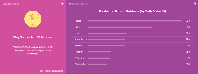
Another red flag inside Sage calculates the "exercise equivalent" of the lentils. It tells me that I’ll need to play soccer for half an hour to burn these off—never mind the fact that my resting metabolism may do the job just fine.
When I ask Slover about whether including exercise recommendations within the interface might be guilting people for every calorie they eat, he told me that an expert on the project had brought this very issue up. "But it gives people a good rubric to compare food they hadn’t had before," he says. "It’s like a benchmark that allows people to compare different products easier."
The platform is still in its infancy. And its design will be better informed by a larger sample set. Sage’s database currently contains about 2,000 items consisting of top sellers at Whole Foods and crowdsourced recommendations by nutritionists. As a result, most of these items are what most of us would consider healthy—frozen fruits and veggies, yogurt, and fish. When Sage starts to build in more processed foods, including the really unhealthy sodas and munchies, warnings like "careful" may change by default because they’ll just look silly when the warning on a bag of lentils is the same as one a bag of Cheetos.
Sage, for all its flaws, is an excellent beacon of where things are headed. The future of the food label will be more personal and more interactive. With smartphones, we don't even need our food labels to even live on the food anymore. And that changes everything.
No comments:
Post a Comment